
By Delaney Runge ’24
Major: English; Minors: Education Studies, Creative Writing, and Journalism, Editing, and Publishing
Contributor Biography: Delaney Runge is an English major and triple minor in Education Studies, Creative Writing, and Journalism, Editing, and Publishing. During her time at Washington College, she has served as the president of Zeta Tau Alpha, sung as a soprano in Wacapella, worked for both The Elm and The Pegasus, and was inducted into Phi Beta Kappa. Following graduation, she will be interning at the Hagley Museum and Library as an archival intern.
Brief Description: In this research paper, I chose to analyze different editions of Charlotte Brontë’s Jane Eyre to discover what kind of paratexts were included in books aimed at different audiences. Through an exploration of various editions of the 1847 novel, I found that paratexts such as forwards, essays, pictures, etc. were included in order to draw a certain kind of reader to that specific version of the text. Additionally, the reader that I perceived the edition was for held bearing on what the cover design depicted of the plot. Overall, this research paper opens up readers to the work that paratexts do for the form of the physical book.
The following was written for ENG 460: Book History and American Print Culture
Introduction
At the start of the Book History and American Print Culture class, I was excited to look at books through a new lens. As an English major, a lot of the work that I do with books revolves around the words written within them rather than their physical form. I have done some work with paratexts, or materials associated with but separate from the main text of a book, previously in classes with Associate Professor of Eigteenth- and Nineteenth-Century Literature Dr. Charles. One particular example that comes to mind is from the Jane Austen class I took with Dr. Charles, where we discussed the original cover page of Emma, where Austen dedicated the work to the Prince Regent, poking fun at the crown prince via a paratext of the novel. Studying the cover page of Emma sparked my interest in the physical nature of books, but it was not until I took the Book History course that I put my enthusiasm to use.
Early in the Book History class, we did a group activity reviewing different editions of The Last of the Mohicans by James Fenimore Cooper, discussing elements such as cover pages, chapter format, incorporated images, and physical elements like embedded bookmarks. Doing this exercise in class and discussing the different elements of each version piqued my interest beyond what I had learned with Dr. Charles: it was fascinating to me that the same book could take on so many different formats.
When Professor of English and American Studies Dr. Knight initially posed the question, “What are you curious about involving book history and print culture?” my initial answer was, “Different editions of the same book—perhaps Jane Eyre.” From the start of thinking about it, I knew what the general topic of my research project would be. After reviewing the different editions of The Last of the Mohicans, I knew that I wanted my project to be of a similar nature. Before starting the Book History class, I knew that many books with older publication dates have a diverse set of covers, often due to their age and the fact that they now reside in the public domain. My motivation for looking at editions of Jane Eyre is a result of my Senior Capstone Experience for the English Department. I wanted to be able to connect the work I have been doing for my thesis with the kind of examination of literature done within Book History. Therefore, I decided that (with my SCE based on Jane Eyre by Charlotte Brontë and Wide Sargasso Sea by Jean Rhys) I could utilize one of these books for my project. Ultimately, I decided to focus on Jane Eyre due to its age and the likelihood of finding a variety of covers and editions.
For my Book History Research Project, I chose to investigate various editions of the novel Jane Eyre by Charlotte Brontë to see how different versions of the book portray the story through the cover, as well as through paratexts beyond the text of the novel itself. Through my experience as an English major, I have gained some insight about how to best utilize paratexts; I have discovered that many of the books commonly read for class are scholarly or critical editions that contain extra materials, whereas books read for pleasure often do not contain the same breadth of resources. For this project, the goal was to look at various editions of the same novel and determine what kind of reader it was marketed for—either scholarly or casual. In doing this analytical work, my hope was to better understand how cover art and paratexts play a role within the way a book is perceived, and what may intrigue a reader to pick up a certain edition over another.
I had a bit of previous insight into different editions of Jane Eyre; prior to the Book History class, I already owned two editions of the novel: a 2014 W.W. Norton Critical Edition and a 1960 Signet Classic Edition. These two editions provided a basis for my interest since they are so different from one another. The Norton version is a larger paperback with a picture of a young girl on the cover, emphasizing the bildungsroman nature of the novel; it also contains many additional scholarly texts about the story. However, the 1960 Signet version’s cover depicts Jane and Mr. Rochester, emphasizing the romance aspect of the novel. Also, this edition contains the novel’s text and the the preface that seems to be included in all versions of Jane Eyre. Noticing these variations made me wonder what other iterations of the novel would look like. With this interest, my project topic was chosen, and the questions began to form.
At the start of my project, the question I asked first was “How are covers and paratexts of different editions of Jane Eyre from various publishers and publication years catered towards their intended audience?” This question has stayed relatively the same throughout the process, with some adjustments including incorporating the peer feedback I received on my Research Prospectus. I knew that I wanted to focus on cover art and paratexts, but the second part of my question, specifically “cater towards their intended audience,” was a point of concern during peer review, as it felt unrelated to the direction of my research. In response to this feedback, I changed my question to improve specificity, and to make it true to my research. I realized that the actual question I was working towards answering in my research was, “How are covers and paratexts of different editions of Jane Eyre from various publishers and publication years used to market their copy towards a specific kind of reader either scholarly or casual?” This revision of my research question created more specificity to the topic I was really trying to investigate in comparing versions of Jane Eyre.
As I worked to answer this question, I intended to come to some conclusions about what differentiates various editions of the same book, thus making readers want one version over another. I expected to gain a larger understanding of what kind of paratexts are used for books, how often paratexts are used within novels, and the differing influences of cover art in various editions. In just glancing at the covers for the Jane Eyre novels that I collected, I could tell that they all were about the same story, but emphasizing different elements of it; so I expected to find some sort of through-line for the novel’s covers, and the kind of edition that the novel was being marketed as on these elements.
Methodology
To start off my research, the first step was to locate various editions of Jane Eyre to analyze. As I previously stated, I already owned two copies of Jane Eyre, the 2014 W. W. Norton Critical Edition and the 1960 Signet Classic Edition. These two editions were the basis of my initial research, but I knew that I would need to find more editions to evaluate their covers and paratexts. To begin my search, I went to the Clifton L. Miller Library to investigate what Washington College has in terms of Jane Eyre copies. Unfortunately, all the versions I could find within the campus library did not have covers with images, but were all just clothbound hardbacks. Due to this discovery, I determined that I would have to find editions of Jane Eyre elsewhere.
Thankfully, Dr. Knight and the English Department made it possible to allot seventy-five dollars to each student so that we could either buy materials or travel elsewhere to conduct research. I went with the former and used the funds to purchase multiple editions of Jane Eyre from Amazon and Thrift Books. To find the editions I would use, I started by searching for “Jane Eyre” and seeing what came up in the search results for both websites. I used Thrift Books to locate an older copy, ultimately ordering a Scholastic Library Edition from 1962. For Amazon, I started by scrolling through the options available, trying to find a range of covers, publishers, and years. My strategy was to order a wide expanse of books to analyze so that I would have enough data to form an understanding into the perception of the novel. In the end, I ordered a 2006 Penguin Classics, 1981 Bantam Classics, 2022 Harper Muse Painted Edition, 2014 Alma Classics, and 2009 Deluxe Penguin Classics Edition. Overall, the funding that I was granted afforded me the opportunity to order a wide range of books and allowed me to do this project in the way that I saw fit.
Once I determined my primary sources, I found my secondary sources by using Miller Library’s search option, OneSearch, in order to utilize their digital and physical collection, as well as to access an Interlibrary Loan. Through this search, I was able to gather resources that I felt would help my research endeavors.
After reviewing my secondary sources—including Bang’s How Pictures Work, Matthews and Moody’s Judging a Book by Its Cover, and Connors and Allred’s “Picturing Diversity”— I gathered background information on my topic. Respectively from each source, I gathered data mainly on the function of pictures, the importance of book covers and their various elements, and questions to consider when analyzing paratexts. For each edition, I asked a series of questions: What and who does the cover depict? What and who are not shown on the cover? What additional resources (introductions, prefaces, pictur es, essays, etc.) are included in this edition of Jane Eyre? What kind of reader does this book appear marketed towards? From my answers to each question, I drew conclusions about each version of Jane Eyre.
Findings
For my analysis of each edition, I went in order of publication. The 1960 Signet Classics Edition (figure 1) features cover art by Jonah Hill that shows Jane in the forefront and Mr. Rochester in the background riding a horse. By showing the female heroine and her love interest in the novel, this cover emphasizes the romance plot. Positioning Jane in the front shows her importance, but having Mr. Rochester there also insinuates his influence on the text. This copy also features “Charlotte Bronte” on the cover but lacks the “ë,” perhaps revealing a lack of attention to the proper spelling of the author’s name. The paratext included within this edition is an author biography, the preface, and an afterword. Combined with the cover art and added paratexts, this edition feels as though it is intended for a casual reader who likely will not be looking into the text at a deeper level.
Next, I analyzed the 1962 Scholastic Library Editon (figure 2) which features cover images on both the front and back of the book. The front cover depicts Jane in the foreground of the image, but she is facing away so readers cannot see her face. Rochester again is shown on a horse in the background, but here he is centered and his face is shown. Again, this cover works to show the novel’s main lovers right away, thus bolstering the romance aspect of the book. The back cover shows an image of Rochester’s home, Thornfield, burning—an event which happens in the novel, but that Jane is not even present for, revealing that this cover shows events even if they are not from Jane’s perspective. The paratext for this version includes “A Word to the Reader” and a picture before the first chapter of a scene at Thornfield House. This text seems to be for a casual reader of the text, especially one that is not as familiar with the details of the story. Due to its inclusion of “A Word to the Reader,” it shows that this book works to assist readers in getting their bearings before diving into the book.
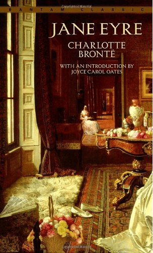
The 1981 Bantam Classics Edition of Jane Eyre (figure 3) uses the Jessica Hayllar painting “A Coming Event” for the cover. This painting features a girl centered in the back of the image, meant to be understood as Jane. As the center person of the painting, she is clearly the focus of the text, but the forefront of this image more so depicts the house that she sits in, and emphasizes the grandeur of the home, which takes away the focus on Jane that other covers have. Additionally, while it is hard to make out, standing with the girl is a man who is meant to be Mr. Rochester, which shows that while the emphasis is not on him, she is still present and influential on the text itself. This edition’s paratext includes an author biography, an introduction, and the preface. Overall, this version also seems to be for a more casual reader. Through the cover, it works to hint at the riches that Jane will encounter and the love plot within the novel.
Following the Bantam Classics Edition, there is a bit of a jump to the 2006 Penguin Classics Edition (figure 4). This version’s cover features the painting “Only a Lock of Hair” by Sir John Everett Millais, which depicts a woman in Victorian dress braiding her hair. The cover art here, by showing only Jane, emphasizes that the story is just that—hers. This cover represents the bildungsroman nature of the novel and how it all revolves around Jane, the clear focus. This edition contains a wide range of paratexts including an author biography, introduction, the preface, a note on the text, suggested further reading, an appendix, and notes from the text. Pairing the cover art and the multiple paratexts, this edition would be classified as a scholarly edition. Compared to the other versions, it clearly has an aim to depict the plot of the texts in a more all-encompassing way and contains many resources for readers to delve further into the text.
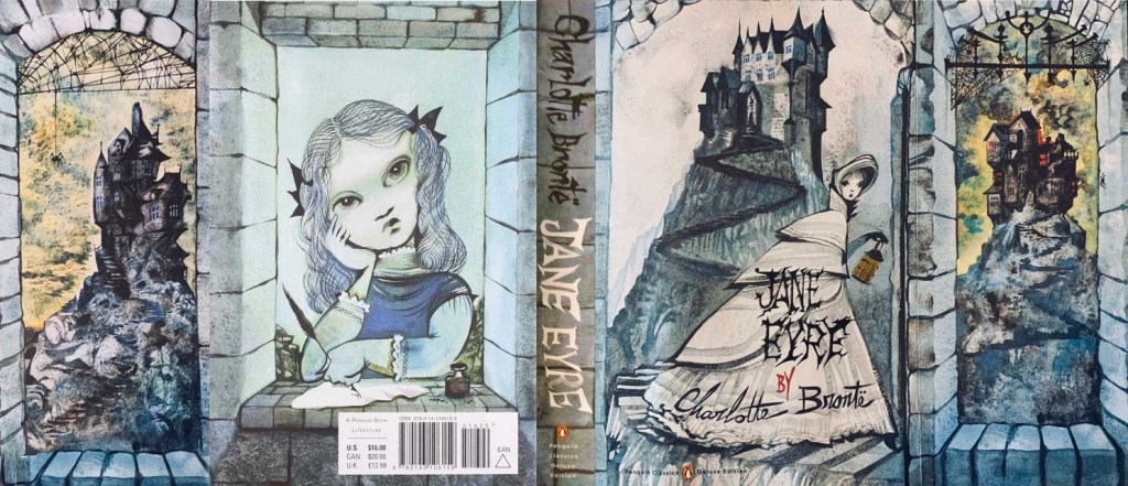
Also from Penguin, the 2009 Penguin Classics Deluxe Edition (figure 5) has images by artist Ruben Toledo on the front and back cover, as well as on the inside flaps of the novel. On the front cover, it shows an older Jane in the forefront with Thornfield behind her; whereas the back cover depicts a young Jane, perhaps at Lowood, the place she spent her adolescence. The inside flaps have two depictions of Thornfield, both unscathed and burning, thus showing the development of this setting throughout the novel. Overall, due to the color scheme and art style, this cover art does a good job of showing off the gothic nature of the novel. Additionally, by showing both a young Jane and an older version, it emphasizes how the novel follows her as she grows up and is not about a singular time in Jane’s life. It is not just about her adult life, but rather a larger portion of time, beginning with her childhood and following her into adulthood. For this edition, the paratexts include the cover artist’s biography, an author biography, and the preface. Based on reviewing these elements, this edition seems to be for a casual reader, but perhaps one that knows the story because it is a nicer edition of the novel with extended images via the flaps, and does not have a summary of the novel on the outside as many other editions do.
From 2014, there are two editions. First, the 2014 Alma Classics Editon (figure 6) depicts a silhouette of Jane in the center in white thus juxtaposing her from the rest of the cover and making her the focal point of the image. Additionally, she is standing in front of an intricate set of gates with plants on either side. The one concern with this cover is Jane’s dress, which seems to reflect the style of Georgian England rather than of the Victorian Era that Jane Eyre takes place in. Overall, this cover design depicts Jane as the main character of the text, but also shows her on the outskirts of a place, which is a state that Jane deals with throughout the novel. This edition contains paratext of images of the Brontë family, prominent places within their lives that likely influenced the novel, notes from the text, illusions, and extra materials on Charlotte Brontë’s life. By analyzing its elements, this book is clearly designed for a casual reader, perhaps one that would like to know more about the text and its origins, but not as concerned with the accuracy of the cover design to the time of the original publication.
The final edition reviewed was the 2022 Harper Muse Classics Painted Edition (figure 8). The image of this cover spans both the front and back. On the front cover Jane is seen in the foreground, facing away from the reader and towards Mr. Rochester. The back cover shows Thornfield, and (all the way up in the attic) a very small depiction of Bertha. By showing Jane and Mr. Rochester on the cover, this edition works to emphasize the romantic aspect of the book, but it is not afraid to complicate this relationship by adding an image of Bertha, Mr. Rochester’s wife, locked up in the attic. Within this edition, the paratexts included are an author biography and the preface. From these elements, the book seems to be for a casual reader, likely one that is familiar with Jane Eyre due to this editions’ aspects involving cover art as well as that this is a hardcover book with a bookmark embedded.
Following my review of all the editions of Jane Eyre, I have found out a few different things. Each edition, except for one, had the preface from Brontë, showing that some paratexts are universally seen as important for a novel. I found this interesting because I did not initially expect that there would be such a universally used paratext, but these books showed me that there are some extra materials deemed important for all readers. Overall, I only classified two editions as scholarly; these and others that lean towards the scholarly tend to feature Jane alone on the cover, whereas the editions more for casual reading tend to feature both Jane and Mr. Rochester. It was compelling to view that, often, for more casual readers, the cover art wants to show the romantic nature of the text, when based on my own reading the book is far more focused on Jane and her coming of age than it is about romance. Yes, Jane falling in love with Mr. Rochester is a big part of the plot, but it seems not as prevalent as Jane herself. Another observation I made about the covers is that out of all eight editions I reviewed, only one featured Bertha, and even then on the back cover. This, to me, shows that within this story, there is a clear distinction by the vast majority of readers and publishers that contend Jane, or Jane and Mr. Rochester, are the most vital characters within the novel, wheras a character like Bertha is less important.
By the end of my work and to answer my research question, I contend that the visual elements of cover art, such as the choice of which characters to include, work to persuade readers towards a distinct copy of a novel. Additionally, paratexts play a key role in the way an edition will serve a reader outside of the text, and for the editions deemed scholarly, they are full of extra materials that casual editions distinctly lack. By making editions that differ so widely, readers can choose one that will function best for them as they take on reading a classic novel like Jane Eyre.
Conclusion
When I started this project, I was unsure of what I was getting myself into, but I thought it would be interesting to analyze and review various copies of Jane Eyre, considering I have spent a lot of time with the novel over the past year or so while working on my Senior Capstone Experience. At the end of this project, I have a much better understanding of book covers, such as the way that they convey different messages without directly expressing their meaning in words. After reviewing different editions of Jane Eyre, I feel that we should throw out the phrase, “Don’t judge a book by its cover.” Looking at the cover of a book can truly provide vital information to a reader about the plot and character focuses of a text.
As with cover art, I also have a much greater appreciation for paratexts. Admittedly, I am often the kind of reader who skips right past any introduction, preface, or other additional material to get right to the main text. Following this research, however, I now have a better understanding of the ways that paratexts function within novels and how they act as indicators of the type of reader book may be best suited for.
Looking over my project, I believe that despite my small sample size, my research findings are interesting to consider when looking at a book of the literary canon such as Jane Eyre, and the ways that this book can greatly differ between editions. If I were to further expand this research, I would try to increase my pool of Jane Eyre editions, and go back even further to consider how the text has changed since eighteen forty-seven. Due to monetary and time constraints, however, having the project include older edition, or any more resources would have proven difficult. Another way that I could expand this research would be to compare these findings on Jane Eyre with those of various editions of another classic novel. I would be curious to see how different books would compare to the findings I have had for this research.
Works Cited
Bang, Molly. How Pictures Work. Chronicle Books, 2016.
Brontë, Charlotte. Jane Eyre. Alma Classics, 2014.
Brontë, Charlotte. Jane Eyre. Bantam Dell, 1981.
Brontë, Charlotte. Jane Eyre. Harper Muse, 2022.
Brontë, Charlotte. Jane Eyre. Penguin Books, 2009.
Brontë, Charlotte. Jane Eyre. Penguin Classics, 2006.
Brontë, Charlotte. Jane Eyre. Scholastic Magazines, Inc., 1962.
Brontë, Charlotte. Jane Eyre. Signet Classic, 1960.
Brontë, Charlotte. Jane Eyre. W. W. Norton & Company, Inc., 2016.
Connors, Sean P., and Johnny B. Allred. “Picturing Diversity: Why Readers Should Always
Judge Books by Their Covers.” Voices from the Middle, vol. 28, 2020, pp. 53-57.
Matthews, Nicole and Nickianne Moody. Judging a Book by Its Cover: Fans, Publishers,
Designers, and the Marketing of Fiction.” Ashgate Publishing Company, 2007.
Appendix

(figure 1)
Jane Eyre: 1960 Signet Classics Editon


(figure 2)
Jane Eyre: 1962 Scholastic Library Edition
(figure 3)
Jane Eyre: 1981 Bantam Classics Edition

(figure 4)
Jane Eyre: 2006 Penguin Classics Edition
(figure 5)
Jane Eyre: 2009 Deluxe Penguin Classics Edition

(figure 6)
Jane Eyre: 2014 Alma Classics Edition

(figure 7)
Jane Eyre: W.W. Norton Critical Edition


(figure 8)
Jane Eyre: Harper Muse Painted Edition
